

 |
| How to Choose Colors for Your Space: 1. Mood, 2. Temperature, 3. Harmonies |
1. Mood
In a previous home decor article we discussed how choosing the mood for your room was the first essential step to starting a decorating project.
Once you've established the mood, be it light and airy or warm and cozy, you need to then determine the color scheme for your space.
2. Temperature
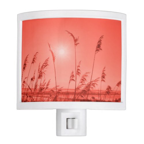
Warm Color Choices for Home Décor
Red, yellow and orange, and variations of them, are considered warm colors.
If your goal is to create a space that feels like being wrapped in a blanket, safeness and security, then dominate your space with warm colors.
Where we live also determines our approach to decorating. Standard logic applies: Colder climates lean towards warmer decorating themes and warmer climates attract cooler décor themes. However, don't be guided by that, do what you like.
Cool Color Choices for Home Décor
Blue, greens and light purples fall into the cool color category. Cool colors remind us of water and the sky. Depending upon how you mix and match colors they can also reflect the feeling of ice and snow.
Think about nautical themes where multiple shades of blue are used, and you'll get a good idea of what cool energy is suppose to feel like.
3. Harmonies - Use the 60-30-10 Rule
Decorate using the 60-30-10 rule. It's an easy to understand basic rule outlining percentage of color use.
60 Percent: The main color occupies 60 percent of the space. Use this color for larger areas such as furniture, walls and flooring.
30 Percent: The secondary color choice would consume 30 percent of the décor in the space. Logically you would use the next obvious items to feature this color. Items to consider in this shade would be drapes, smaller furniture pieces, bedding and even an accent wall.
10 Percent: The third color choice would be used for smaller accessories such as throw blankets, pillows, lamps and wall art.
How to Put it All Together - Choosing the Actual Colors
1. You've selected the mood. Check.
2. You've decided upon the temperature. Check.
3. Now you need your 60-30-10 color scheme
BUT...
You're not sure how to choose the actual colors for the 60-30-10 rule.
Last week we discussed Pantone's color of the year for 2019. In that article three color schemes were outlined, however there are several more to consider.
Here's a brief summary of color harmonies:
1. Triadic Color Scheme - Three colors evenly spaced on the color wheel
2. Square Color Scheme - Four colors evenly spaced on the color wheel
3. Complementary Colors - Colors directly opposite each other on the color wheel
4. Analogous Color Scheme - Colors that are adjacent to each other on the color wheel
5. Monochromatic Color Scheme - Involves all the shades in one particular color
6. Achromatic Color Scheme - Unsaturated or near neutral colors such black, browns, greys or any hue or lightness
Here's a sample of a color wheel so you can see quadrants and opposites at a glance.

A Personal Choice Video from Wayfair that Explains 60-30-10 and Color Schemes
If you learn best by watching videos, this one is easy to understand. Before tackling your next decorating project, start by watching this:
Here's to your decorating freedom, have fun :)
Note: The author may receive a commission from purchases made using links found in this article. “As an Amazon Associate, Ebay (EPN), Esty (Awin), and/or Zazzle Affiliate, I (we) earn from qualifying purchases.”
FOLLOW US ON:


 is happy as a single father & he is not looking for love. After being recently burned in a relationship, Kate is not looking for love either. However, when Dan & Kate meet, there is an immediate spark of interest.")


