

 |
| What is Pantone's Color of the Year for 2019? |
Each year Pantone chooses the color based on what hue best represents what's needed most in society.
The 2019 color choice was based on friendly, joyous, and cheerful human connection. With the overwhelming influence of digital technology consuming our lives, 2019's color represents a step back into human, earthly connection.
The 2019 Color of the Year is Living Coral 16-1546
Living Coral as explained by Pantone represents nature and connection.
"Living Coral emits the desired, familiar, and energizing aspects of color found in nature. In its glorious, yet unfortunately more elusive, display beneath the sea, this vivifying and effervescent color mesmerizes the eye and mind. Lying at the center of our naturally vivid and chromatic ecosystem, PANTONE Living Coral is evocative of how coral reefs provide shelter to a diverse kaleidoscope of color" - by Pantone.comWhy Does Pantone's Color of the Year Matter?
If you don't care, it doesn't matter. However color surrounds us from cradle to grave and most of what we do involves color.
BUT remember, color represents feelings. Our feelings often dictate our life. Those wiser than us know how to harness it.
Every color evokes emotion. Color means something, says something and is used by companies to sell you stuff. So even if you don't care, color is affecting you, sometimes subliminally.
Color of the Year Drives Trends from Fashion to Home Décor
You're not going to choose the design for a room based on the color of the year are you? Actually if you love the 2019 color of the year and want to recreate it's energy for a space, then yes you will.
This particular shade of coral encompasses several percentages of multiple colors:
- 98.82% red
- 46.27% green
- 41.47% blue
How to Choose Colors to Match Living Coral in Your Room's Design
Without getting overly technical, using the diagram below, I've outlined a few fundamentals about color.
 |
| Choosing Colors for a Room Design Featuring Living Coral |
TRIAD Color Harmony for Your Room:
When you're using a triadic color scheme you choose three colors evenly spaced around the color wheel. Notice on the above photo that two colors are labelled 'Triad'. Both of those colors, plus the 'Living Coral' are evenly spaced on the color wheel. If you're comfortable with these shades, the color choices are done for you. Go ahead and pick accessories such as rugs, drapes and wall color based on these three colors.
SQUARE Color Harmony for Your Room:
A square color scheme are four colors equally spaced around the color wheel. Again, to make it easier for you, match 'Living Color' with the three boxes above labelled 'Square'.
COMPLEMENTARY Color Harmony for Your Room:
Complementary colors are opposite each other on the color wheel. When you want to have a particular item or items stand out in the space, use a complementary color. However, keep them to a minimum to avoid your room being too stark.
INVERTED Colors:
The inverted color featured above is the 'inversion' or inside out version of 'Living Color'. Use it for accessories or other items you want to stand out or pop in the space. One example could be pillows and throw blankets.
The above is just a brief outline of color combinations for 'Living Coral'. There are many other hues and combinations that work.
Here are a Couple of Bedroom Accessories to Inspire You:
Here are a Couple of Bedroom Accessories to Inspire You:
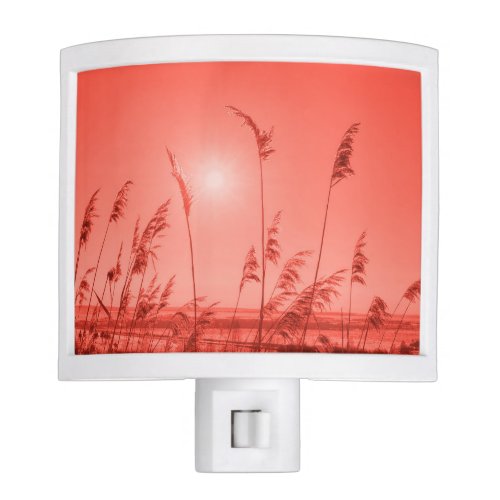
Personalized Modern, trendy, living coral,template, 2019 pantone throw pillowPantone 2019 Living Coral - Sun-kissed wheat in coral night light

Note: The author may receive a commission from purchases made using links found in this article. “As an Amazon Associate, Ebay (EPN), Esty (Awin), and/or Zazzle Affiliate, I (we) earn from qualifying purchases.”
FOLLOW US ON:


Interesting that Living Coral is the 'color of the year' as I just purchased new yarn in Coral. Must have known subliminally that this was the perfect color to choose. :) Interesting facts about color and its complementary colors.
ReplyDeletePat, lol, it must be in the air. Coral can be such a pretty color in décor and clothes.
DeleteI love coral colors. I'm glad this is the color of the year. Barbara, I always look forward to your Pantone posts.
ReplyDeleteThanks Dawn :)
DeleteCoral is such a pretty color and not one I have included in my current home decor. I always associate coral with Florida, our preferred vacation area. They use a great deal of coral in the condos decor in Florida. It does make you feel very peaceful and relaxed. I love all of the colors in your color diagram above. It would be easy for me to decorate using those pretty colors.
ReplyDeleteI've seen coral used a lot over the decades in Florida décor too. I think the secret is to use it sparingly but vacation condos seem to use multiple shades of it. I do love coral, but it has to be featured properly so as not to be too candy-ish.
DeleteI love the symbolism of the color, but, it is not a color I would choose to live with. Having said that, I can see where a smattering of this color would add a little punch into an otherwise empty corner in my home. So maybe just maybe it will grow on me.
ReplyDeleteYah, it's hard to add a color you're not crazy about, totally agree!
DeleteIt was interesting to learn about the different ways of selecting color combinations from the color wheel. I would never have guessed coral had you asked me what I thought the Pantone Color of the Year was. I don't think I have anything coral colored in my home. I think of it as a more beachy color rather than one for a mountain rustic decorating scene (such as mine).
ReplyDeleteI agree about the beachy feel to coral as well. I would use it subtly in accessories, unless I was lucky enough to have a beach house lol
Delete