Showing posts with label pantone. Show all posts

Sunday, August 13, 2023

Can You Guess the Most Popular Color in the World?

Guess what the most popular color in the world is

Hey there, color enthusiasts and curious minds!

Today, we're diving into a topic that's as vibrant as a summer sunset and as intriguing as a mystery novel – what is the most popular color in the world?

🌈🌈🌈🌈🌈🌈🌈🌈🌈

Drumroll Please......Did You Guess What the Most Globally Popular Color Is?

Alright, first things first – let's talk stats (not really - you can google that anytime!)

 According to a bunch of surveys and color-loving folks around the globe, the heavyweight champion of colors is none other than Blue

Yep, that soothing, sky-like hue has captured the hearts of folks from all walks of life. Seriously, it's like the BeyoncΓ© of colors – universally loved and always in style.

🌈🌈🌈🌈🌈🌈🌈🌈🌈

Which Colors Are the Popular Runner-Ups?

Don't worry; I've got the scoop on that too. Coming in second place is the energetic and fiery Red. It's like the color equivalent of a shot of espresso – bold, attention-grabbing, and impossible to ignore.

But wait, there's more! Grab your shades because Green is also strutting its stuff in the popularity parade. It's the color of nature, money, and envy (but we're not here to judge, right?). Green's that cool friend who's always down for an adventure – the Kermit to our colorful Muppet show.

Oh, and let's not forget about enigmatic Black. It's like the James Bond of colors – sleek, mysterious, and effortlessly stylish. Whether you're rocking a little black dress or decking out your phone in a noir-inspired case, black always adds a touch of class.

But here's a side note about black - from a science perspective, it's void of light and thus not considered a color! Hey, but the artistic world differs on this, and yes, they include it in the bucket of colors.

🌈🌈🌈🌈🌈🌈🌈🌈🌈

Turns Out My Personal Favorites Are Not the Most Popular, But They Do Make the Cut

Some honorable mentions include the sunny optimism of Yellow, the royal and calming embrace of Purple, and the sunny-side-up vibes of Orange - these are my three favorite colors! And I love pink too :)

So, why is blue the undeniable champion of colors? 

Well, psychologists have a theory. Apparently, blue's got this magical way of making us feel all calm and zen. It's like a visual spa day for our minds, which is why you'll find it splashed across everything from hospital walls to social media apps. Plus, let's not forget about that whole "blue sky thinking" thing – who knew color could be so motivational?

🌈🌈🌈🌈🌈🌈🌈🌈🌈

In the end, whether you're a blue-loving beach bum, a red-hot firecracker, or a green machine ready to take on the world, the beauty of colors lies in their ability to evoke emotions, tell stories, and make life a little more exciting. 

So, the next time you're debating between a blue or a red shirt, just remember – you're not just picking a color; you're choosing a vibe!

🌈🌈🌈🌈🌈🌈🌈🌈🌈

And there you have it, my colorful comrades – a crash course in the world's most popular color and its vibrant contenders. Until next time, keep living life in full color, and never be afraid to paint outside the lines! 

🌈🌈🌈🌈🌈🌈🌈🌈🌈

Understanding the basics of color here.

So, what is your favorite color and why?


Note: The author may receive a commission from purchases made using links found in this article. “As an Amazon Associate, Ebay (EPN) and/or Esty (Awin) Affiliate, I (we) earn from qualifying purchases.”


Sunday, April 23, 2023

Understanding the Basics of Color for Home Decor

Understanding the Basics of Color for Home Decor

Understanding the primary colors is essential in color theory, as they form the basis for all other colors. The three primary colors are red, yellow, and blue, while the three secondary colors are orange, green, and violet. In addition, there are six tertiary colors, which are formed by mixing a primary color with a secondary color. These include red-orange, yellow-orange, yellow-green, blue-green, blue-violet, and red-violet.

Each color has its own unique meaning, symbolism, and psychological effects. Here's a breakdown of the primary, secondary, and tertiary colors, along with their various meanings and common usage:

Primary Colors:

  • Red: This color is associated with passion, energy, and warmth. It can evoke feelings of love, anger, and excitement. Red is often used in dining rooms, kitchens, and living rooms to create a cozy and inviting atmosphere.
  • Yellow: This color is often associated with happiness, optimism, and creativity. It can also symbolize caution or warning. Yellow is popular in kitchens, nurseries, and offices, as it is believed to stimulate the mind and improve concentration.
  • Blue: This color is often associated with calmness, tranquility, and stability. It can also represent sadness or depression. Blue is commonly used in bedrooms, bathrooms, and offices to promote relaxation and peacefulness.

Secondary Colors:

  • Orange: This color combines the energy and passion of red with the warmth and happiness of yellow. It can evoke feelings of excitement, enthusiasm, and warmth. Orange is often used in children's rooms, playrooms, and exercise rooms to create a fun and energetic environment.
  • Green: This color is associated with nature, growth, and balance. It can evoke feelings of calmness, freshness, and harmony. Green is commonly used in bedrooms, bathrooms, and living rooms to promote relaxation and a sense of balance.
  • Violet: This color is often associated with luxury, creativity, and spirituality. It can evoke feelings of mystery, elegance, and sophistication. Violet is often used in bedrooms, living rooms, and meditation rooms to promote a sense of peace and tranquility.

Tertiary Colors:

  • Red-Orange: This color combines red's energy and passion with orange's warmth and excitement. It can evoke feelings of fun, energy, and excitement.
  • Yellow-Orange: This color combines yellow's happiness and warmth with orange's excitement and enthusiasm. It can evoke feelings of joy, warmth, and positivity.
  • Yellow-Green: This color combines the freshness and balance of green with the happiness and optimism of yellow. It can evoke feelings of growth, harmony, and creativity.
  • Blue-Green: This color combines the calmness and stability of blue with the freshness and balance of green. It can evoke feelings of peace, relaxation, and tranquility.
  • Blue-Violet: This color combines the tranquility and stability of blue with the creativity and luxury of violet. It can evoke feelings of mystery, elegance, and sophistication.
  • Red-Violet: This color combines red's energy and passion with violet's creativity and luxury. It can evoke feelings of excitement, luxury, and sophistication.

In conclusion, understanding the meanings and effects of different colors is essential in creating the desired atmosphere in any space. By using primary, secondary, and tertiary colors in the appropriate ways, you can create a cohesive and harmonious environment that promotes the desired emotions and feelings.


Note: The author may receive a commission from purchases made using links found in this article. “As an Amazon Associate, Ebay (EPN) and/or Esty (Awin) Affiliate, I (we) earn from qualifying purchases.”


Sunday, January 9, 2022

What is The Pantone Color of The Year for 2022 - Come See

Do you ever wander over to the Pantone website? If not, be sure to take a minute and check it out. It's filled with excellent advice about color combinations for almost every aspect of living.

Annually, Pantone selects  a color of the year that reflects "our global culture, expressing what people are looking for, that color can hope to answer."  - Quote by Pantone.com

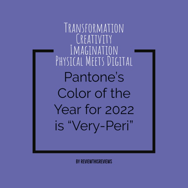
 Congratulations to Very-Peri (17-3938)

According to Pantone, this combination of periwinkle blue with violet-red undertones reflects these transformative times. Color is an absolute in the creative digital space we find ourselves living in. Blue combined with violet-red is Pantone's choice for a year trending towards joyous, emotional, and creative expression.

Here's a brief video featured by Pantone with their chosen color, Very-Peri:


If You're Looking to Create This Color Via HTML Color Codes, Here is the Code

The HTML code for Very-Peri is #6667ab. If you create online graphics for any particular purpose and want to use Pantone's color choice for 2022, you'll need this code.

Don't confuse the Pantone color number 17-3938 for the HTML color code. As mentioned above, the HTML color code is #6667ab. I quickly created the main photo above using this code.

My Own Personal Opinion on Very-Peri

Violets and purples are some of my favorite colors, especially for bedroom decor. It seems to never go out of style. 

Very-Peri combines violet-red with blue to produce a soft color, yet one that evokes a courageous mood due to the hidden undertones of red.

Personally, I would combine Very-Peri with yellows or grays for a guest room or our primary bedroom. Another great space for this color is the home office, especially for those working in a field that demands some level of creative thinking - isn't that all fields? 

The thing to remember with color, any color, is "flow." Does the color flow with the overall decor theme of your home? For larger homes, changing colors from room to room is manageable; however, smaller spaces often present a challenge. If you're painting a small home or apartment, staying within the same shades is a safe way to approach your wall colors. Let the drapes, furniture, and accessories introduce the contrast and pattern.

Have fun with color because color IS fun.


Note: The author may receive a commission from purchases made using links found in this article. “As an Amazon Associate, Ebay (EPN) and/or Esty (Awin) Affiliate, I (we) earn from qualifying purchases.”


Sunday, December 20, 2020

Home Decor Color Inspiration with Pantone's Color Choices for 2021

Check Out & Review Pantone's Color Picks for 2021

Choosing our home decor colors based on Pantone's yearly pick isn't normally the way we select our hues. However, you may be inspired to include shades or versions of their choices based upon the inspirational messages behind why Pantone selected them.

Ultimate Gray & Illuminating Yellow - Welcome to 2021

Most of us know that gray and yellow are lovely for home decor. Including these two colors in your space will add a touch of modern with a touch of yesterday. I like to think of yellow as a bright beacon from years gone by and gray as a way to move forward.

I'm not sure whether Pantone sees it the way I do; however, color triggers something unique in each of us, and this color combination has always reminded me of the old with the new. But hey, I'm not saying yellow is "old"; just that it was a popular color choice in our home decor back in the 1960s and 1970s. 

Did You Know This About Yellow and Gray?

Yellow is the color of intelligence. Yes, that's right. You're not only honoring your family color memories, but you're also enhancing minds. 
"Did you know that yellow is said to be the color of the thinker versus the dreamer"

Gray is known to be the color of compromise as well as intellect. You'll find a great deal of gray in modern home decor pieces and paint. I've personally felt gray on its own was never enough - for me, there needs to be a bright color offset. Pantone's choice of vibrant yellow with gray ties two sides of a coin together. 

Why Pantone Selected Ultimate Gray & Illuminating Yellow for 2021

If you've ever visited the Pantone website, you already know that there is an inspirational purpose behind their annual color picks. They aim to capture the mood of us mere humans and build upon it with hope through color. 

Here's a brief summary by Pantone about their 2021 color picks:

"A message of happiness supported by fortitude, the combination of PANTONE 17-5104 Ultimate Gray + PANTONE 13-0647 Illuminating is aspirational and gives us hope. We need to feel that everything is going to get brighter – this is essential to the human spirit."

Take a minute to read the entire reason for Pantone's pick for 2021. It's always fun and inspirational. Again, their website is here.

Here's a handy tip; the Hex Codes for each color's website references are - Yellow #F8D948, and Gray is #959A9C.

Here Are Some Lovely Home Decor Pieces For You - Featured in Yellows and Grays


Note: The author may receive a commission from purchases made using links found in this article. “As an Amazon Associate, Ebay (EPN) and/or Esty (Awin) Affiliate, I (we) earn from qualifying purchases.”


Most Recent Reviews on Review This Reviews


Search for Reviews by Subject, Author or Title

The Review This Reviews Contributors


SylvestermouseSylvestermouseDawn Rae BDawn Rae BMbgPhotoMbgPhotoBrite-IdeasBrite-IdeasWednesday ElfWednesday ElfOlivia MorrisOlivia MorrisTreasures by BrendaTreasures by BrendaThe Savvy AgeThe Savvy AgeMargaret SchindelMargaret SchindelRaintree AnnieRaintree AnnieLou16Lou16Sam MonacoSam MonacoTracey BoyerTracey BoyerCheryl Paton Cheryl PatonRenaissance WomanRenaissance WomanBarbRadBarbRadBev OwensBev OwensBuckHawkBuckHawkDecorating for EventsDecorating for EventsHeather426Heather426Coletta TeskeColetta TeskeMissMerFaeryMissMerFaeryMickie_GMickie_G


Review This Reviews is Dedicated to the Memory of Our Beloved Friend and Fellow Contributor

Susan DeppnerSusan Deppner

We may be apart, but
You Are Not Forgotten


“As an Amazon Associate, Ebay (EPN) and or Etsy (Awin) Affiliate, I (we) earn from purchases.” Disclosure Statement

X