


I love how this design turned out. I started out by making various leaf designs, trying different techniques. The other designs were different shades of lavender and purple backgrounds. They didn't quite fit what I was after so I moved on. Then I decided to play around with my paints and squirted some purple on my printing area, and my eye caught sight of the bold vivid blue. Voila. Perfect!
"And they go with yellow," I thought. I painted a yellow background. At first, I had the leaves come off from one side, kind of flowing towards the center. And then I just kept going. "That's right, pointing towards the center, towards the area of importance," I thought. Then I kept filling in the outer edges, making the border look full and lush. That's it!
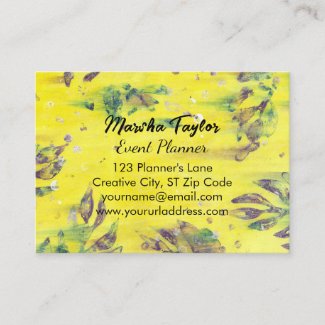
This design is perfect for anything of importance; i.e. monograms, name, address, letter writing - whatever the case shall be.
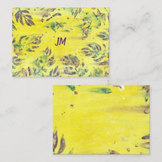
The first product I designed with this was business cards. All of the main information is on the front of the card. I made the back of the card, solid yellow. It coordinates with the front of the business card, and can also easily be located if the card is mixed in with other cards, by it's bold and vibrant back.
All of the text areas on any of these products can be easily customized on the provided template forms.
I always purchase my business cards from Zazzle. Early on, there was a mess up on one of my business cards order, but Zazzle readily replaced them. Everything has worked out great since then.
You can choose from matte and glossy finishes for the various card typs on Zazzle, and also from various card stocks which come in an assortment of colors, textures, and finishes.
On the note cards, I enclosed the border design tighter around the center, making it perfect for a short name or monogram. The border design on the back of the note card is spread out to allow an open writing area.
I have purchased a variety of cards from Zazzle, and they have all turned out lovely. The colors are crisp and the card stock has always been great.
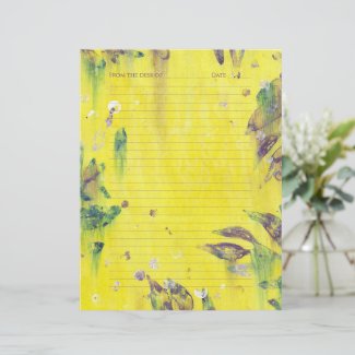
I used the same idea with the border being spread out on the lined stationery. The design is the same on both sides here.
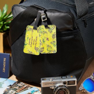
I used the same mindset when designing the luggage tags, as I did for the note cards. One side is for the monogram, and the other side is for the contact info.
Do you have a favorite or a request? Let me know in a comment below.
Cheryl Paton
Note: The author may receive a commission from purchases made using links found in this article. “As an Amazon Associate, Ebay (EPN), Esty (Awin), and/or Zazzle Affiliate, I (we) earn from qualifying purchases.”
FOLLOW US ON:


Your leaf design works so well on each of the products you present here, Cheryl. Well done.
ReplyDeleteThank you Wednesday Elf, and thanks for your visit.
DeleteA very pretty design, Cheryl. I especially like the luggage tags. They would be quite unique and definitely make your luggage easy to spot on an airport carousel.
ReplyDeleteThank you Sylvestermouse. I agree, they would be perfect to help spot one's luggage. : )
DeleteA lovely design, Cheryl! I agree with Sylvestermouse that the luggage tags are distinctive and would be very easy to spot on a baggage carousel.
ReplyDeleteThank you Margaret. Yes, they would be easy to spot and easy to customize too. : )
DeleteI love the bright colors of your design - orange and yellow are both my fave colors so my eye was immediately drawn to it - those luggage tags are a real standout too - great way to spot your luggage when picking it up!
ReplyDeleteGlad you like them Barbara; they'd be a perfect choice for you.
Delete