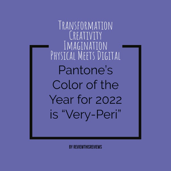
Do you ever wander over to the Pantone website? If not, be sure to take a minute and check it out. It's filled with excellent advice about color combinations for almost every aspect of living.
Annually, Pantone selects a color of the year that reflects "our global culture, expressing what people are looking for, that color can hope to answer." - Quote by Pantone.com
Congratulations to Very-Peri (17-3938)
According to Pantone, this combination of periwinkle blue with violet-red undertones reflects these transformative times. Color is an absolute in the creative digital space we find ourselves living in. Blue combined with violet-red is Pantone's choice for a year trending towards joyous, emotional, and creative expression.
Here's a brief video featured by Pantone with their chosen color, Very-Peri:
If You're Looking to Create This Color Via HTML Color Codes, Here is the Code
The HTML code for Very-Peri is #6667ab. If you create online graphics for any particular purpose and want to use Pantone's color choice for 2022, you'll need this code.
Don't confuse the Pantone color number 17-3938 for the HTML color code. As mentioned above, the HTML color code is #6667ab. I quickly created the main photo above using this code.
My Own Personal Opinion on Very-Peri
Violets and purples are some of my favorite colors, especially for bedroom decor. It seems to never go out of style.
Very-Peri combines violet-red with blue to produce a soft color, yet one that evokes a courageous mood due to the hidden undertones of red.
Personally, I would combine Very-Peri with yellows or grays for a guest room or our primary bedroom. Another great space for this color is the home office, especially for those working in a field that demands some level of creative thinking - isn't that all fields?
The thing to remember with color, any color, is "flow." Does the color flow with the overall decor theme of your home? For larger homes, changing colors from room to room is manageable; however, smaller spaces often present a challenge. If you're painting a small home or apartment, staying within the same shades is a safe way to approach your wall colors. Let the drapes, furniture, and accessories introduce the contrast and pattern.
Have fun with color because color IS fun.


